mix

Friday, 30 November 2012

Here's one we made a while ago and looking over the images again we've realised how top-heavy we are on lighting. There are some really beautiful pieces here - the Tab T lamp designed by Edward Barber and Jay Osgerby for FLOS is a classic in the making and the large Spica Light from IACOLI & MCALLISTER is simply breath-taking. But our favourite has to be the WALL LIGHT designed in the 1950s that sits on a teak and metal arm ... that one's right up our street.


Images:
Brutalist wall relief, Art of Vintage | Armshell, Modern Love via Design Addict | Interior, Marjon Hoogervorst | Wall Light, City-Furniture | Spica Light, Iacoli & McAllister | Interior, Dwell | Tab T Light, Yvonne Koné and Line Klein | Staircase via Emmas DesignBlogg

opportunities

Wednesday, 28 November 2012

Last night we came across some words which resonated with us .... "There are times when I feel this pointlessness with blogging - the vanity, the misconception, the pressure to constantly one-up yourself ...".  Yes, yes, that's us.  "... but there are other times when I'm abundantly grateful for it.  It's given me incredible opportunities ...".  And that's us too.  Only recently we were presented with an incredible opportunity that just wouldn't have come about had we not confiscated this tiny corner of the internet and made it our own. And right now we're feeling abundantly grateful - not just because this incredible opportunity came knocking, but to our readers for bearing with and providing us with the momentum to keep at it.

Thank you.

let there be light

Friday, 23 November 2012

We're in the midst of choosing some new lighting for our hallway, and decision making is proving a little tricky.  Now if money were no object we'd probably opt for a little something by Poul Henningen - the PH ARTICHOKE for instance, or the PH50 pendant - hey, we're not fussy.  But as money is an object - curse you oh piggy bank - and with a concern that there may be a design rule out there somewhere which says hanging an Artichoke in a hallway ain't the done thing or something, we've taken a more realistic approach to lighting that sad and neglected corridor that is our hallway.


We're down to two options, both of which we love - the white E27 SOCKET LAMP by Mattias Stahbom for Muuto and the NUD CLASSIC light fitting.  Both perfect, although the NUD Classic comes with a huge array of colourful textile cables to choose from which adds another layer to the decision making process.  Either fitting can be finished with a large filament light bulb - and the lightbulb, that lightbulb, is such a beautiful thing.  Time to flip a coin ...

Images:  Haus London

orange

Wednesday, 21 November 2012

We've featured the work of textile designer Claire-Anne O'Brien BEFORE, and the great thing about designers - they're only a collection away from their next set of designs.  So when we spotted this FITE stool from O'Brien's OLANN collection we couldn't resist sharing it here.  Isn't the colour and texture just a joy?  So unique, so different.  So fabulous.


And for those of you who need orange in your life, we hope you enjoy these wonderful images!

Images:  Claire-Anne O'Brien

clean living

Tuesday, 20 November 2012

Clean Living Clean Living Clean Living Clean Living Clean Living Clean Living Clean Living

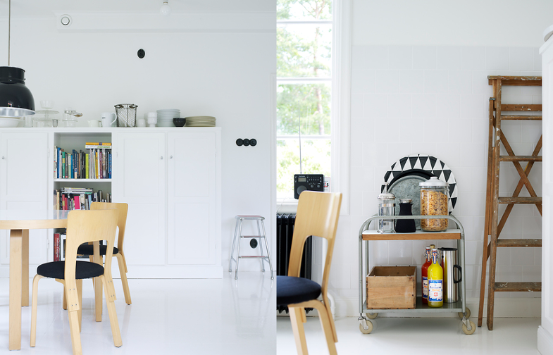
Just love the colour palette - or rather lack of it - the bold prints on the wall, the contrasting floors throughout, the sweeping spaces and sense of light in this Stockholm apartment.  This is all good, but it's the chair goodness that is really, really tasty.  Those MODEL 66 chairs by Alvar Aalto and the 3013s by Arne Jacobsen ... delicious!

Images: PATRIC JOHANSSON for ELLE INTERIÖR (via LA MAISON D'ANNA G)

mix

Saturday, 17 November 2012

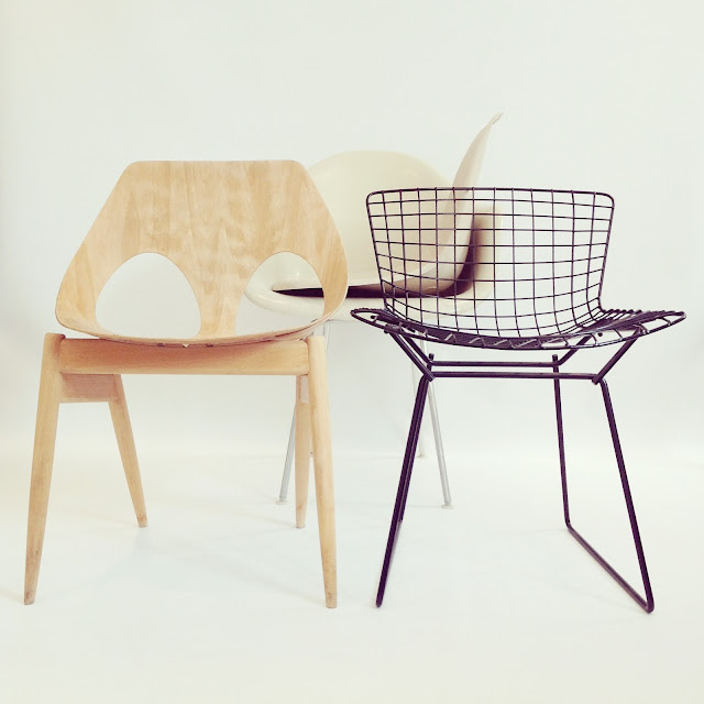
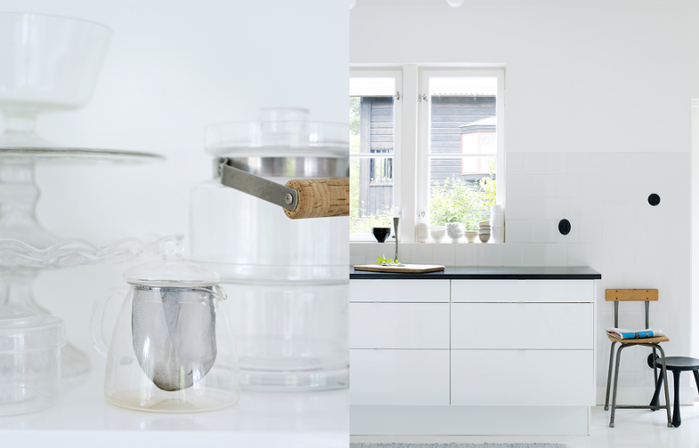
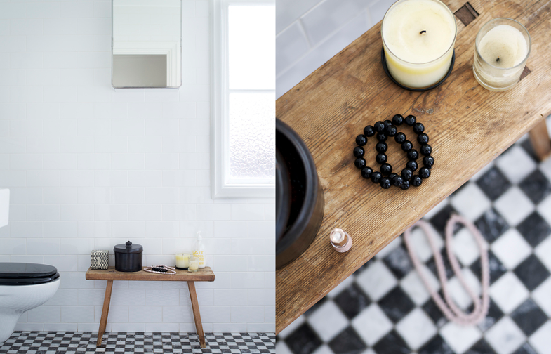
Things have been a little quiet around here lately, so to right a wrong we've put together a new mix focusing on that satisfying monochrome colour scheme we're currently smitten with plus elements of wood to add some warmth.  Needless to say, everything here is on our want list ... but in reality if we manage to organise our book collection to resemble those stocked books above and get our hands on that amazing crystal poster by Debbie Carlos, we'd be happy ones.


Wishing you a fab weekend.  We're off to collect a new chair today.  Super excited, details to follow!

Images:
Interior, Bostad Erikolssen | Books, Janne Peters | 3103 chairs by Arne Jacobsen, H55 | Series 7 chairs by Arne Jacobsen, Moderne Solitude | Triplex Lamp via Cherry Blossom | Cyrstal poster by Debbie Carlos, Etsy | Karin armchair by Bruno Mathsson, Bukowskis via Architonic | SM05 chair by Cees Braakman and Boxes by Studio Pastoe, Viaduct | Enamelled cups, Sit and Read

restoration

Monday, 12 November 2012

Remember THIS?  Well remember away, 'cause that baby is yesterday's news.

So, how do you restore an Eames shell?  Easy.  First you read (and re-read) the ins and outs of restoring an Eames shell on CHAIRFAG, and for the sake of completeness head over to see how PLASTOLUX tackled a similar job  All good, except we were dealing with something a little different - a shell which, in a previous life, had been upholstered with naugahyde or fabric ... whichever, whatever.  What next?  Thankfully we were au fait with the goings on at MANHATTAN NEST, and it just so happened that Daniel had already undertaken a comparable RESTORATION with quite spectacular results.


We didn't deviate that much from the tried-and-tested way of doing things, but here's a few out-of-the-ordinaries we came up against:

Foam remnants: This was fairly dried out. Not flaky dry you understand - no, that would have been too easy. To remove this, our tool of choice was a bog standard kitchen knife. Using the tip of the non-serrated edge at just the right angle we scraped back and forth, back and forth, back and forth, back and forth ... like, forever.


Adhesive:  We managed to get rid of all but the most stubborn smears of adhesive using a fine sanding sponge lightly soaked in water.  Daniel at MANHATTAN NEST had left us a helpful COMMENT regarding a product he'd heard great things about called 'SOY-IT' to strip the adhesive off.  Upon further investigation, it turns out that here in the UK you can only buy vat loads of this stuff at a time. Great.  What next?  Oh yeah, that trusty workshop staple - nail polish remover.  Ah-huh.  Yeap.  It worked.


Discolouration:  We now had the beginnings of a great looking shell, but there was discolouration in the fibreglass between the area we'd worked on compared to the fibreglass which had been foam/adhesive free for some time.  Not to worry ... electric sander time.


Penetrol:  Except Penetrol over here is called Owatrol, and Owatrol sell about ten thousand different products ... it's this OWATROL OIL you'll need.

We covered the SHOCKS in a previous post and found ourselves a H-base courtesy of that well-known auction website ... everything fitted nicely, thank you very much.  It ain't perfect - it has three holes in the seat and the shock mount adhesive has bleed through the fibreglass.  Do we care?  No, no we don't.

thoughts

Sunday, 4 November 2012

Recently we've been focusing our attention on the reliance we place on others - designers, chair manufacturers, dealers - to produce visual content for the blog.  Whilst in the past we've enjoyed trawling the interweb in search of favourable designs, beautiful shapes and inspirational interior spaces, the flip side is a blog which is nothing more than a catalogue, a reference point, a tool - devoid of any personality - used to locate, look up and read up on chair designs and designers.

It was never our intention to be a resource, a data bank - mainly because we don't have the requisite knowledge to fulfil this type of role - but this is what we've become.  Or at least, this is what our blog stats are telling us we've become.  Whatever .... but those stats are talking to us and we're listening.  And the more we listen, the more the whole blogging experience seems something of a treadmill from which, at times, we want to jump.

We reached a point not too long ago when continuing to churn out the same old same old was becoming increasingly difficult. Feeling we could hardly muster up enough enthusiasm to continue and constrained by a seemingly self-imposed blog about chairs, it felt like it was chairs or bust.  Was it possible to have a blog called chairsmith and write about something, anything, other than chairs or chair-related nonsense?  Would anyone notice either way, and in the grand scheme of things, did it actually matter?

In an attempt to move forward we considered giving up chairsmith and starting something afresh - we even went through the whole rigamorle of thinking up new names for our new blog.  But wait a minute .... what of all the hard work we'd put in to date and, more importantly, could we return to the lonely days of flat-lining blog stats - curse you blog stats - or a follower count in single digits?  No. No way.  For. Get. It.

So with the excitement of a new blog and the possibility of a new blog design well and truly behind us, we've decided to go for broke and stay put.  Not least because chairsmith was always meant to be a platform for our shoppe (yeah, OK, we're working on it) and having started brand building long before having anything to sell, swapping names simply to justify blog content seems, well, silly.

So, how to make the transition from what we've been doing to something a teensy bit different?  And what exactly will the 'teensy bit different' actually be?  Like we have a plan.  Let's just say things might be a teensy bit different around here from now on.  Hold tight!
 

chairsmith All rights reserved © Blog Milk Powered by Blogger