


The interior stylist in question is LOTTA AGATON, and back in February I got wind she was heading over to Michigan to work with none other than HERMAN MILLER. I couldn't wait to see the results. Why? Because I wouldn't have necessarily put these two names together.
Last year Lotta styled STRING for their stand at DESIGN JUNCTION. I went along for a gander, and standing there surrounded by Lotta's props made me feel like a child in a sweet shop. There was so much to see. The shelves went up and up and each one was meticulously filled with complementing paper goods interspersed with desk lamps and odd, but always interesting, curios. The palatte was simple. White. With a bit of neutral thrown in for good measure. It was fascinating. Did I notice the String? No, not really. But then I wasn't there for the STRING.
Lotta Agaton working for STRING, or STRING working with Lotta Agaton I get. The shelving system was after all designed by fellow Swede Nils Strinning. And shelves are supposed to have stuff on them, that's what they're for. So it makes sense I suppose to show the shelves off with, well, stuff on them. But chairs? I mean the most inticing of chairs is an empty chair. An empty chair is an open invitation, it says what it needs to say, which is nothing more than 'sit here'. But a HERMAN MILLER chair, an iconic chair, a design classic … no styling required, surely?
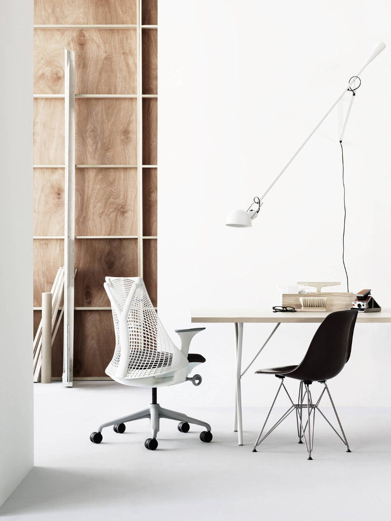
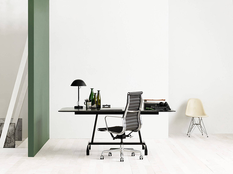
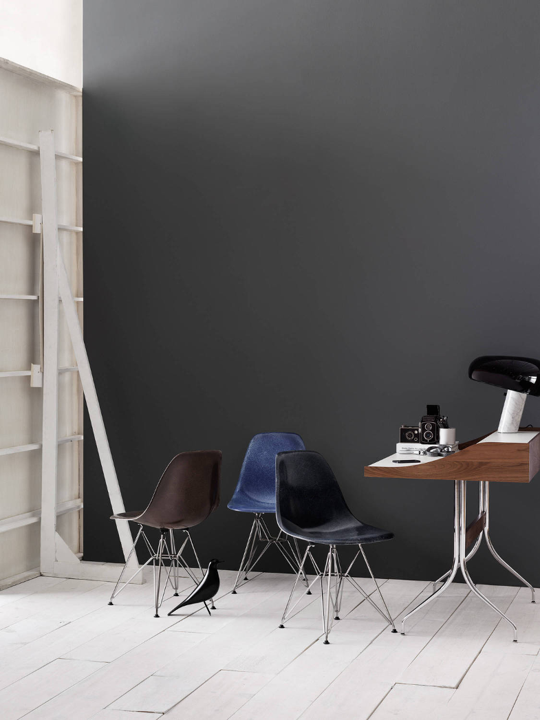
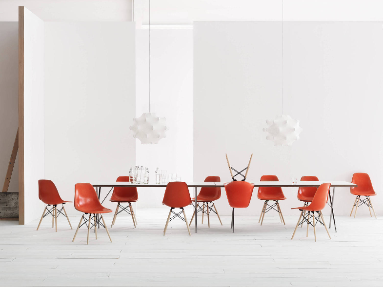
I'm happy to see the chairs have been left to speak for themselves. The 'new' fibreglass shells which HERMAN MILLER is once again able to produce thanks to new production methods look as good as the original designs by Eames from way back when. And while these 'reissues' are a little too new for my vintage tastes, there's no denying that set against these calm yet equally atmospheric backdrops they certainly look the business.
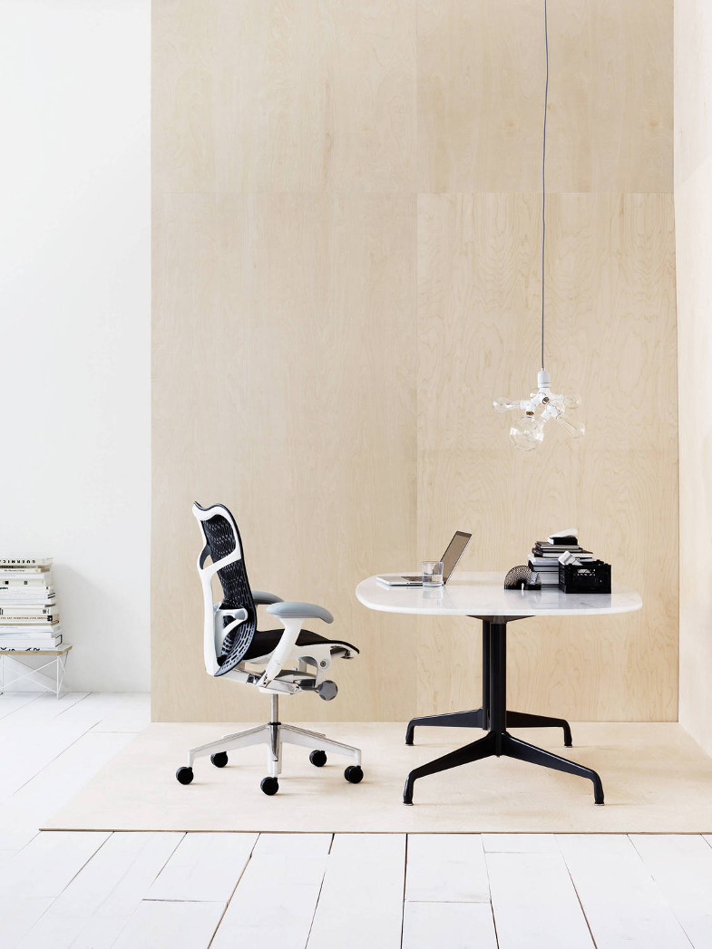
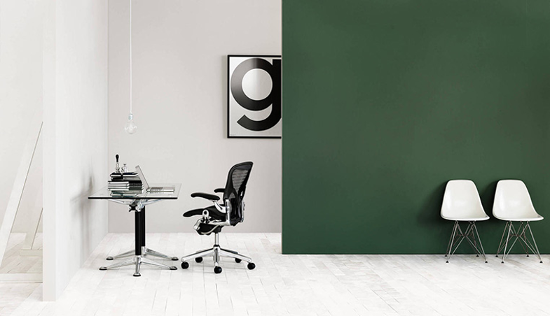
As for the styling, it's as subtle as it is Scandinavian. I adore the use of plywood and the hints of a set design to the left or right of shot. And the moods created by the deep green and that melancholy grey. And the sprinkling of statement accessories such as the 265 wall lamp by FLOS, posters by PLAYTYPE and the BERGMAN LIGHTS as well as the interesting bits and bobs which may up the desk top displays.
So I admit it … I admit to being drawn in by the impeccably styled nature of these images. But it's the furniture that holds my gaze.
Last year Lotta styled STRING for their stand at DESIGN JUNCTION. I went along for a gander, and standing there surrounded by Lotta's props made me feel like a child in a sweet shop. There was so much to see. The shelves went up and up and each one was meticulously filled with complementing paper goods interspersed with desk lamps and odd, but always interesting, curios. The palatte was simple. White. With a bit of neutral thrown in for good measure. It was fascinating. Did I notice the String? No, not really. But then I wasn't there for the STRING.
Lotta Agaton working for STRING, or STRING working with Lotta Agaton I get. The shelving system was after all designed by fellow Swede Nils Strinning. And shelves are supposed to have stuff on them, that's what they're for. So it makes sense I suppose to show the shelves off with, well, stuff on them. But chairs? I mean the most inticing of chairs is an empty chair. An empty chair is an open invitation, it says what it needs to say, which is nothing more than 'sit here'. But a HERMAN MILLER chair, an iconic chair, a design classic … no styling required, surely?
I'm happy to see the chairs have been left to speak for themselves. The 'new' fibreglass shells which HERMAN MILLER is once again able to produce thanks to new production methods look as good as the original designs by Eames from way back when. And while these 'reissues' are a little too new for my vintage tastes, there's no denying that set against these calm yet equally atmospheric backdrops they certainly look the business.
As for the styling, it's as subtle as it is Scandinavian. I adore the use of plywood and the hints of a set design to the left or right of shot. And the moods created by the deep green and that melancholy grey. And the sprinkling of statement accessories such as the 265 wall lamp by FLOS, posters by PLAYTYPE and the BERGMAN LIGHTS as well as the interesting bits and bobs which may up the desk top displays.
So I admit it … I admit to being drawn in by the impeccably styled nature of these images. But it's the furniture that holds my gaze.


0 comments:
Post a Comment